- English
- Arabic
- Chinese
- Japanese
- Spanish
- Vietnamese


Graphic Design Students on Typefaces
Typefaces are seen daily everywhere you look.
Typefaces are seen daily everywhere you look. Sometimes you don’t even realize the impact that different typefaces have on the human brain. CCD Graphic Design students have strong (also funny) feelings towards certain ones. Watch the TikTok interview version!
The students were asked two questions:
1. What is your least favorite typeface and why?
2. Is it ever okay to use Comics Sans or Papyrus?
Student: Yuritzia J. Servin
Question 1: What is your least favorite typeface?
Answer: Antiquarian Scribe. Lower case is kind of acceptable, but uppercase is not practical and I don’t like the look/feeling of it. Also the tracking for me is not working, even if it changes, it would look bad.
Question 2: Is it ever acceptable/okay to use Comic Sans or Papyrus?
Answer: It depends on the situation, but I would say yes, to each their own.

Student: Cassie Renier
Question 1: What is your least favorite typeface?
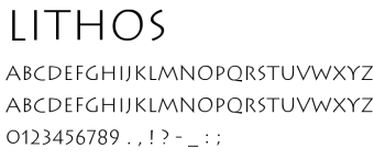
Answer: My least favorite would have to be Lithos. This one is giving me trojan frat party and I really don’t like that.
Question 2: Is it ever acceptable/okay to use Comic Sans or Papyrus?
Answer: I am open to being convinced, but for me personally, it’s a no.
Student: Zoe Whitley
Question 1: What is your least favorite typeface?
Answer: My least favorite typeface is Chelsea Market Script. I think it gives off a very, “live, laugh, love” wooden plaque, gender reveal party vibe that is unappealing and tired. It looks messy and inconsistent and I just think there are much better script options that feel fresh and tasteful, unlike this one.
Question 2: Is it ever acceptable/okay to use Comic Sans or Papyrus?
Answer: I think in a personal capacity, using Comic Sans or Papyrus is fine, but generally for designers, I don’t think there is ever a reason to use them when we have millions of other better fonts at our fingertips.
Student: Kaycee Sapp
Question 1: What is your least favorite typeface?
Answer: My least favorite typeface is Curlz. It looks like something a suburban mom would use on homemade birthday invitations.
Question 2: Is it ever acceptable/okay to use Comic Sans or Papyrus?
Answer: I think Comic Sans has a place and time; for comic books, children’s materials, etc. It also is more accessible for people with Dyslexia.
I guess Papyrus could be used for an exhibit about Egypt, but I think these days there are much better fonts out there, so I personally would never use it.

Student: Christian Herrera
Question 1: What is your least favorite typeface?
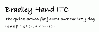
Answer: There are a lot I wouldn’t use like Curlz, Papyrus, Comic Sans, and Bradley Hand.
Question 2: Is it ever acceptable/okay to use Comic Sans or Papyrus?
Answer: They both probably have a use somewhere, good or bad.
Student: Dane Speyer
Question 1: What is your least favorite typeface?
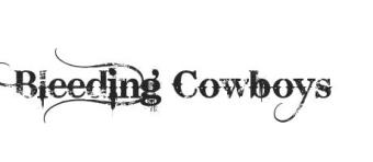
Answer: Bleeding Cowboys. Excessively decorated and too grungy.
Question 2: Is it ever acceptable/okay to use Comic Sans or Papyrus?
Answer: If it’s ironic or if you are targeting a younger audience.